AUTODESK
Kintsugi Workspace


Client : Autodesk
Location : Toranomon, Tokyo
Program : Office
Area : 930 m2
Scope : Design
Year : 2023
Status : Built
Photos : Vincent Hecht
[Click on the picture to enlarge]
Designing office interiors can be categorized into three types of projects:
1. The first type occurs when a client outgrows their current space and wishes to move to a new location, allowing for a fresh design.
2. The second type involves clients who feel their existing workspace needs a programmatic change and intend to revitalize certain areas.
3. The third type is when a client takes over an already occupied space from another company.
The first type of project is typically the easiest, as it allows for a clean slate within the interior envelope of the building. The second type can become more complex, as it requires reorganization of employees and programmatic elements during construction.
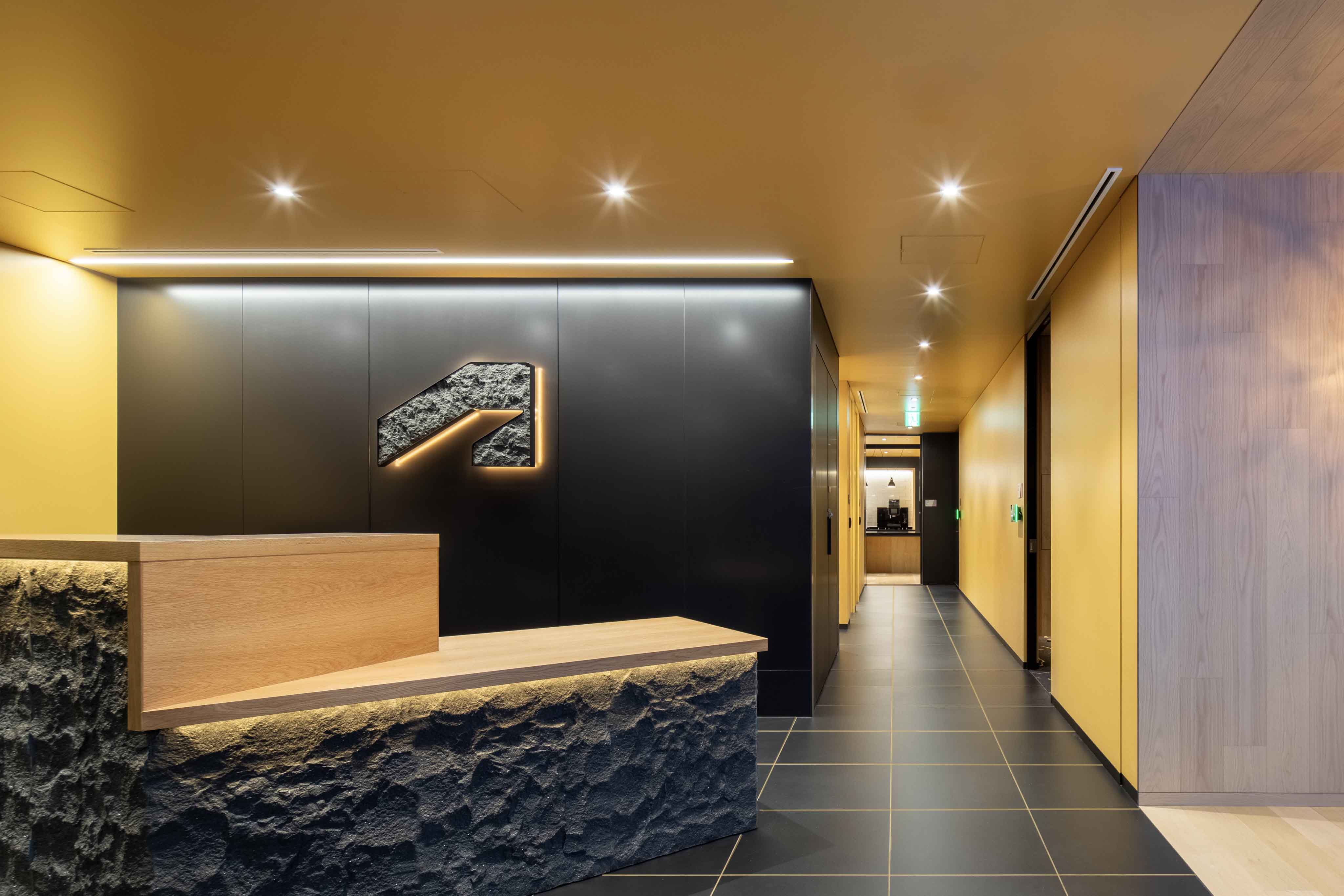
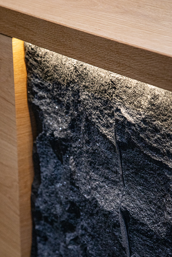
The third type, where the client assumes an existing space, poses the greatest challenge. It requires a flexible design to integrate new needs into a space that is largely already complete. The challenge here extends beyond design to handle construction budgets, as the main reason for taking over an existing space is to minimize changes.In this particular project, the client wanted to incorporate a Japanese aesthetic into an already well-structured space.
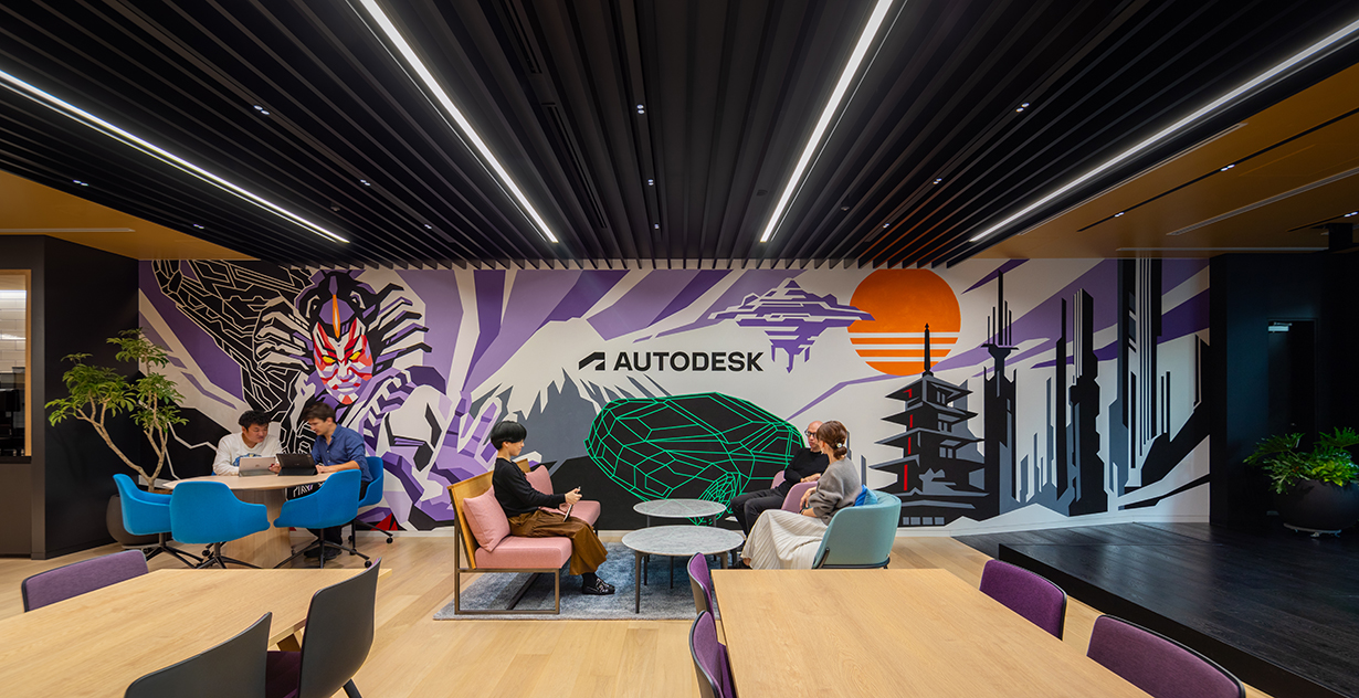
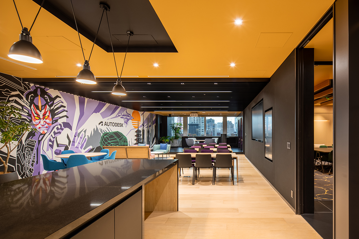
However, the existing color palette was dull and monotonous. Additionally, there was a request to incorporate elements of corporate branding and identity features.While global corporations often aim to be culturally sensitive in their local offices, one common pitfall is that the cultural aspect may only serve as a superficial visual reference. To address this, we proposed two conceptual ideas: kintsugi, which celebrates the beauty of imperfection, and kumiko as a visual element. Kintsugi, for instance, uses gold to repair broken pottery, illustrating that even the restoration of damaged or old objects can enhance their beauty.
Our goal was to demonstrate that we were not merely erasing the history of the previous office but rather complementing the existing space with a warmer color palette and carefully selected materials. We aimed to show how the new environment could acquire a distinct character through these changes.
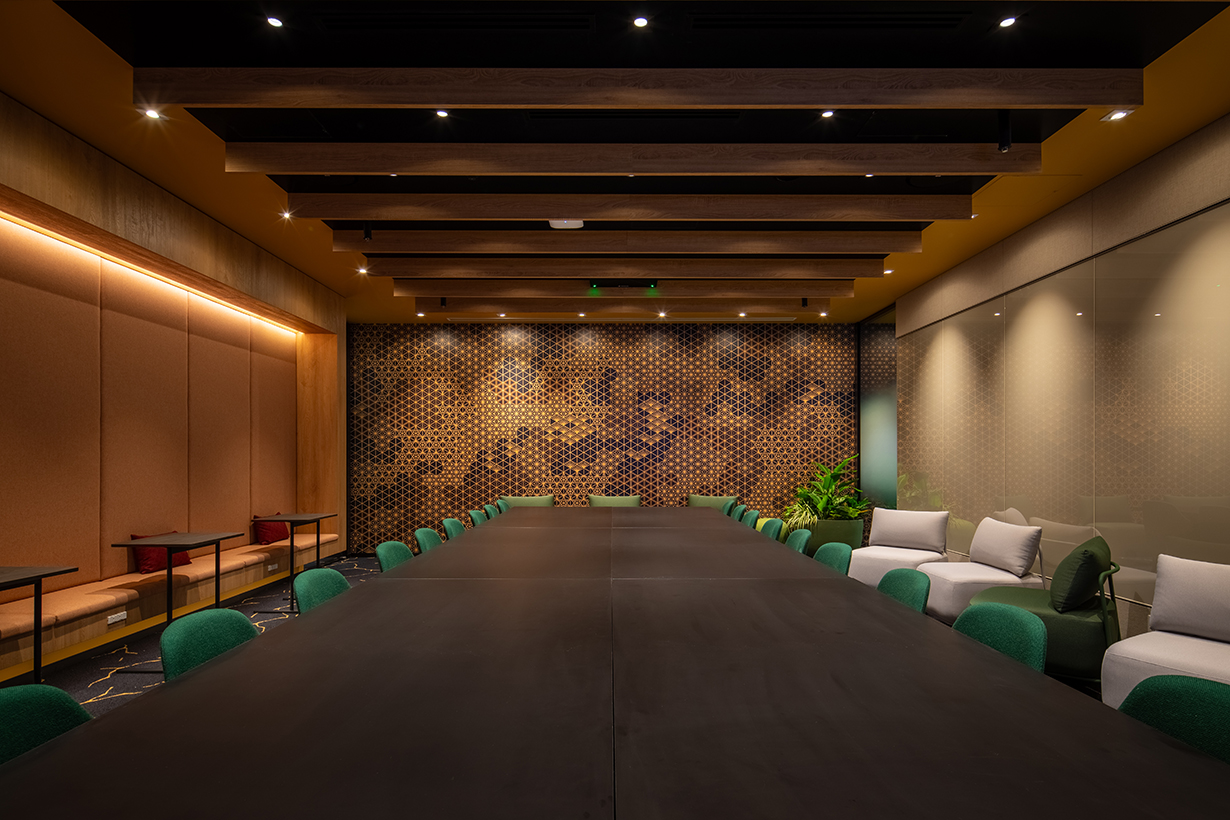
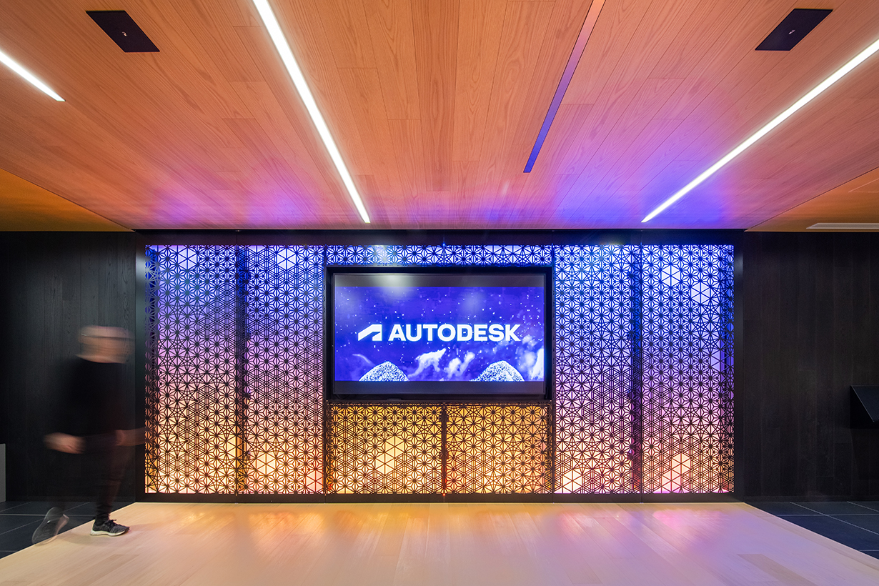
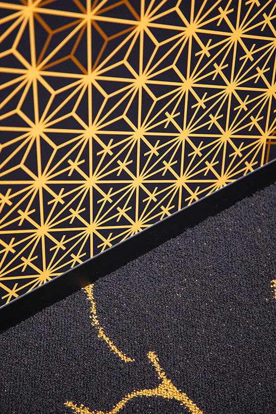
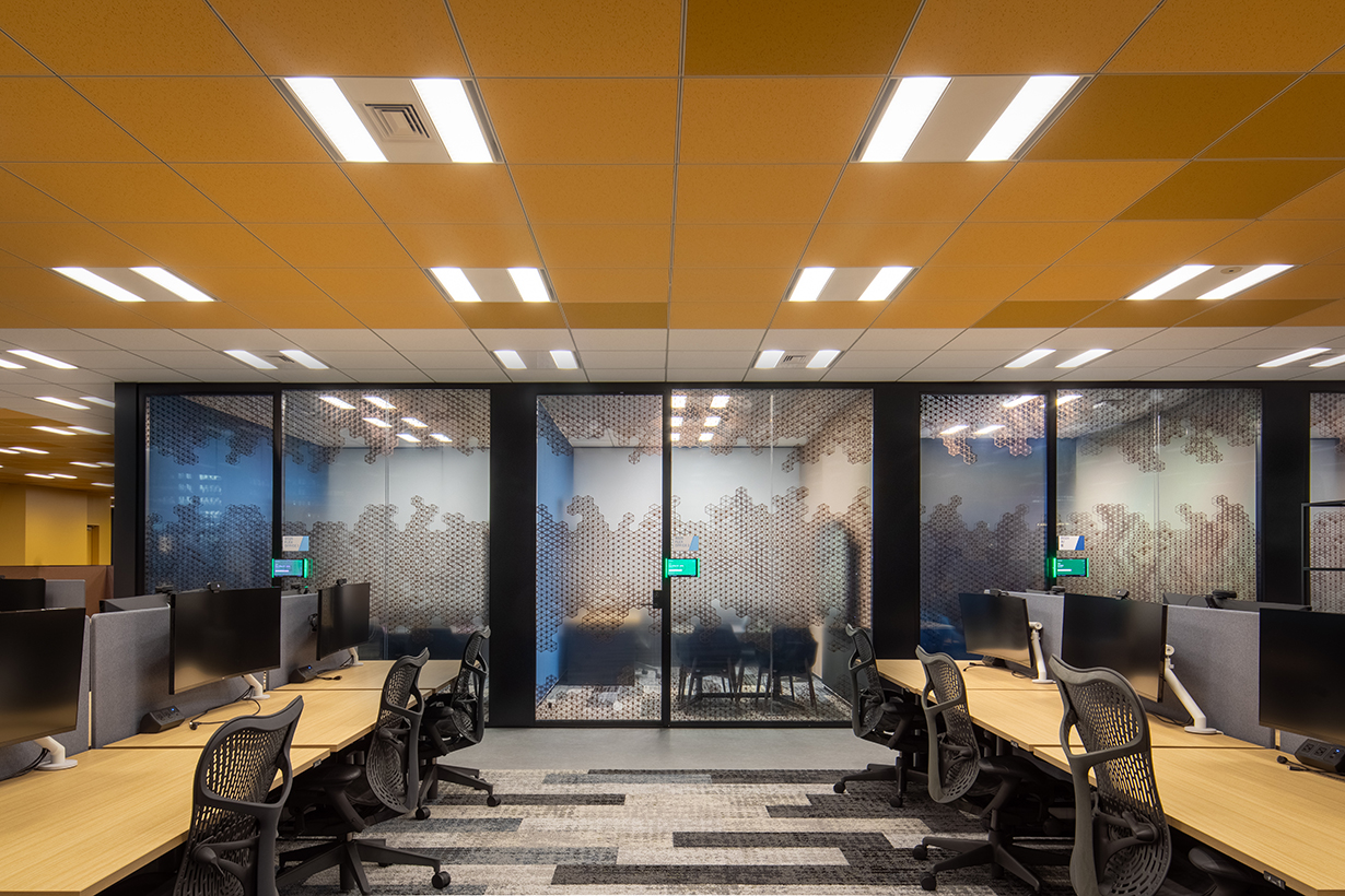
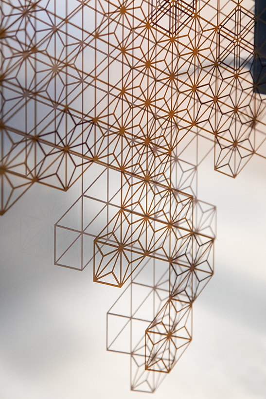
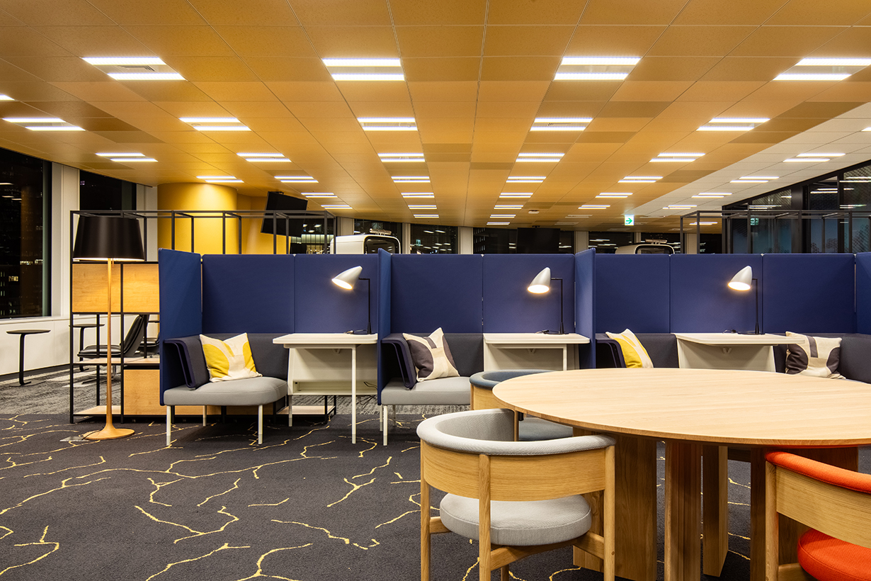
We installed the kumiko pattern throughout the office, using it as a backdrop in a new multipurpose room and as a privacy film in the internal meeting rooms and phone booths. In the reception area, we created a large back-lit metal panel cut in a kumiko pattern. LED strip lights were added to create various seasonal scenes featuring the kumiko design.
オフィスのインテリアデザインは、次の 3 種類のプロジェクトに分類できます
まず初めにクライアントは働くスペースが手狭になり、引っ越して新しいオフィスを設計したいと考えている場合です。2つ目は現在のワークスペースのプログラム変更が必要だと感じており、スペースの一部を活性化したいと考えているケース、3つ目はクライアントが既存のスペースを他社から引き継ぐケースがあります。
最初のタイプのプロジェクトは、建物の内部空間で、ほぼ白紙の状態から設計を開始できるため、最も簡単です。2 番目のオプションは、建設中に従業員やその他のプログラムによる再構築が必要になるため、より複雑になる可能性があります。3 番目のオプションについては、すでにほぼ完成しているスペースに新しいニーズを創造するため柔軟な設計が必要となるためとても困難です。
今回の課題は、既存のスペースを引き継いだことにより、デザインだけでなく建設予算の関係であまり大きな変更はできませんでした。既存のスペースを引き継いだこのプロジェクトでは、スペース的にはほぼ完璧でしたが全体のトーンがモノトーンに近い色で構成されていましたので、このスペースに日本的なタッチを加えたいと考えました。さらに企業ブランディング、企業アイデンティティのグラフィック要素を内装に取り込みたいという要望もありました。
グローバル企業が現地支社に対してその土地の文化を取り入れたいという考え方は珍しいことではありません。しかし文化的要素をそのままグラフィックに反映すると空間デザインの視点から見たとき、単なる視覚表現として捉えられてしまう場合があります。これを避けるために、私たちは日本の不完全さの中にある美しさの象徴である金継ぎと視覚的要素としての組子という 2 つのアイデアを提案しました。 例えば、金継ぎでは壊れた陶器を修復するために金を使用して、欠陥を強調します。壊れた古い物体を修復することさえも、その美しさの一部になり得る(そしてそうすべきである)ことを意味します。 私たちは、単に以前のオフィスの歴史を消去したのではなく、文化的要素を温かみのあるカラーパレットと考察を重ねた新しいマテリアルで既存のスペースを補完したいと考えました。それを通して新しい空間として生まれ変わることを示しました。
組子模様をオフィス全体に設置、また新設の多目的室の背景として使用したほか、社内の会議室や電話ボックスのプライバシーフィルムとして追加しました。 フロントには組子模様に切り抜いた、バックライト付きの大きな金属パネルを制作しました。 LEDストリップライトが四季折々の組子模様を演出します。